

Traveleco
Crafting a platform
for sustainable travel accommodation
Crafting a platform
for sustainable travel accommodation
User Interface
Travel
Sustainability
eCommerce
ROLE
User Interface
Designer
User Interface
Designer
TIMELINE
From Feb 2021
to March 2022
From Feb 2021
to March 2022
TEAM
I led this project's User Experience (UX) and User Interface (UI), working in accordance with the client’s pre-existing brand guideline.
I also shared my feedback and collaborated with the company to improve their product design.
The responsive website design, both frontend and backend, has been developed by https://tract.design/
BRAND
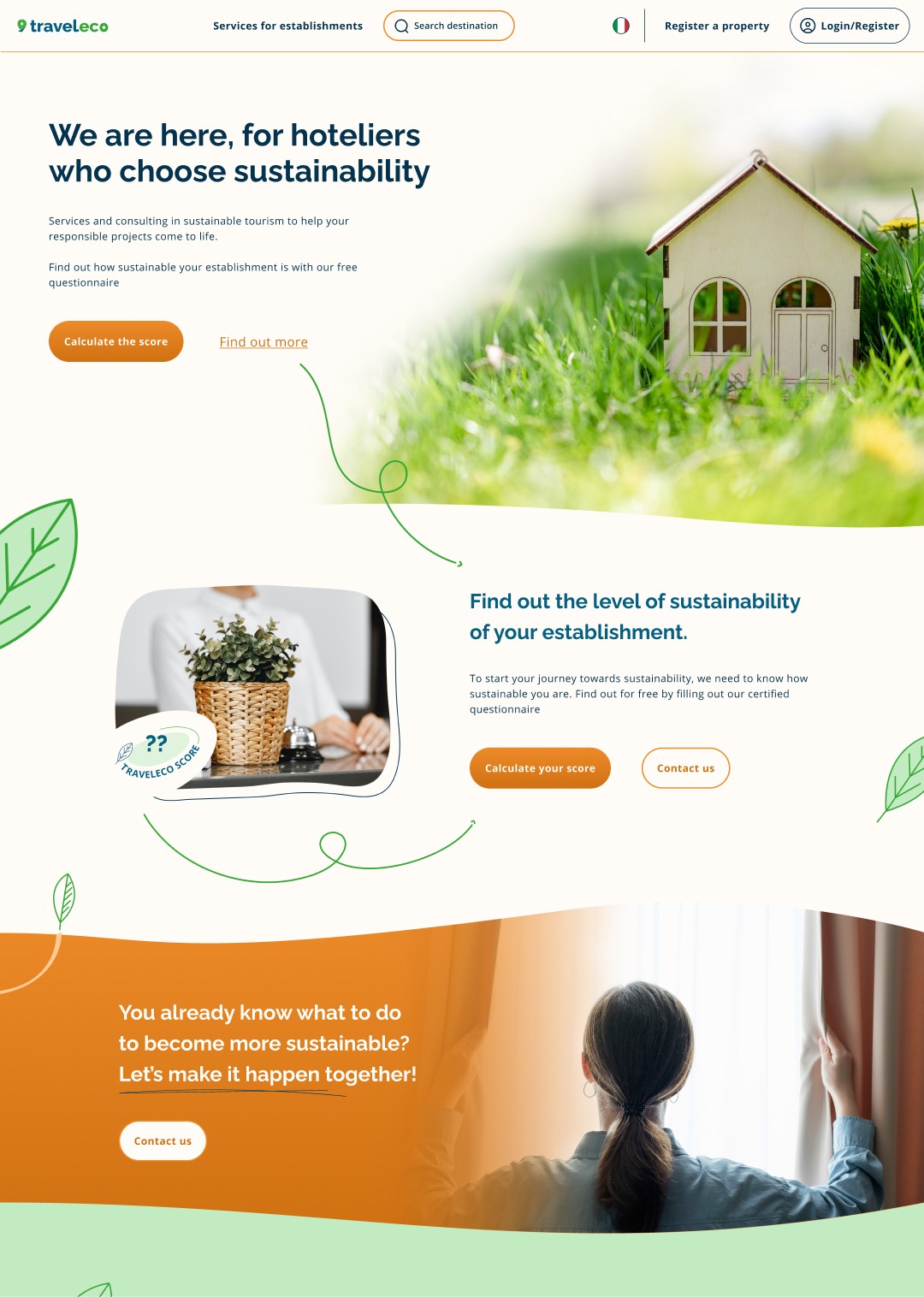
Traveleco is a brand providing services and support to accommodation realities with the need to improve their sustainability level.
To achieve this, they provide e-commerce courses focused on sustainable accommodation, custom coaching and support. Levels of sustainability are being measured through a certified survey.
At the same time, Traveleco provides travellers with a list of accommodation and allows them to book their next journey through the site.
BRIEF
Our goal with the product was to clearly demonstrate their sustainable values in the booking process and offer an ethical alternative compared to other OTA booking platforms.
The previous website offered a limited experience for the users. With the redesign, we wanted to give travelers a frictionless exploring & booking experience. Also, we aimed to provide an easy experience for property owners, guiding them through the process of buying one of the products, publishing and subsequently managing their structure profile.
CHALLENGE
The product needed to fit the needs of two clearly distinct user bases.
The product needed to fit the needs of two clearly distinct user bases.

Say Hi to the users
Say Hi to the users
Property Owners
Property owners are focused on achieving higher levels of sustainability within their accommodation and attract environmentally conscious customers. They present themselves in a distinct sliding scale with varying price points, from family owners of BnBs,to camping site managers, to large corporate hotels groups.
Property owners are focused on achieving higher levels of sustainability within their accommodation and attract environmentally conscious customers. They present themselves in a distinct sliding scale with varying price points, from family owners of BnBs,to camping site managers, to large corporate hotels groups.
Conscious travelers
Primarily, our users have an eye for sustainable eco conscious products and are actively making ethically minded choices. They are open to medium to high cost experiences and potentially act as ambassadors of new eco products.
Primarily, our users have an eye for sustainable eco conscious products and are actively making ethically minded choices. They are open to medium to high cost experiences and potentially act as ambassadors of new eco products.


The design process
The design process
The first step consisted of creating a sustainable and easy-to-implement design system for developers. The Traveleco product is constantly changing, and it's already commended for it’s different sections, search results, e-commerce, and crowdfunding. Therefore, it was crucial for the sustainability of the brand to develop composites that could easily be reused from one section to another.
In the design process, I discovered how powerful the use of colours could be in identifying different sections and products. We have used a default orange in the B2C search section and more blue components for the direct B2C. Green has been used to highlight sustainable elements and sections.
The main colour, orange, has been used for the CTA, a bright colour that clearly stands up and makes the navigation flow.
A complete custom set of icons have been created to deliver a consistent design that compliments the user experience, matching the graphic ethos of Traveleco.
All the elements have been designed to be easily scalable across different devices.
Search results page: results
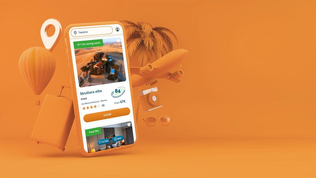
Once the user has researched a city or area, he will find a different card with the results. I've designed three main sections that are flexible and adaptable based on the user's needs and devices. The filters follow a priority order, and the map navigation works independently or in combination with the previous view.
Hovering over one of the results on the list will show more information about that accommodation and appears highlighted on the map as well. If we select a result on the map, we will have the inverse effect. The navigation on mobile is now less compromised, offering a full search experience to compete with other high end search sites.


Search results page: single accommodation
Search results page: single accommodation
The accommodation page presents an open book, providing all the information a user needs to evaluate whether they will proceed with their booking.
Throughout the design I had to take into consideration that different structures can have different complexity and elements, for instance more or less services, donations, pictures or texts. So with this in mind I have created elastic elements that can contain differing amounts of information.

Backend
Backend
The accommodation management page is a fundamental page for any host who wants a guided and clear management system to load and edit the essential characteristics of their property.
Each box, on hover, displays a little description that helps the user insert the correct information and with the nav menu on the left, hosts can easily switch between different sections.
At any moment, the user can edit the box or see a preview of how their future guests will see their accommodation without the need to leave the page.
All the forms, checkboxes, and radio buttons have been designed and specifically chosen to give the best experience to the host, providing a more appealing, friendlier view compared to the site's competitors. We have maximised customizability based on a year’s worth of data and requests.
At the same time, Traveleco has to have a clear panoramic view of their users and the accommodation listed on the website, so as to easily manage and process requests.


eCommerce
E-commerce is the engine that allows Traveleco to generate revenue and deliver all of its services and products. That's why an engaging platform has been fundamental for this design.
The products offered are really diverse:
- Video courses
- Being published on the website's public list
- Webinars
- Services (sponsorships. Carbon Footprint calculator, first assessment)
- The package will include all the products above, including
- Consultations
On top of this, every product uses a different way of being delivered after purchase.
The solution I found to display all the products together whilst cutting development costs, has been one of playing with the elements of the cards video players, colours) to display different products and creating a card that is both responsive and flexible (horizontal and vertical). This creates rhythm to the navigation and engages the user.
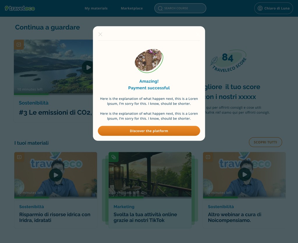
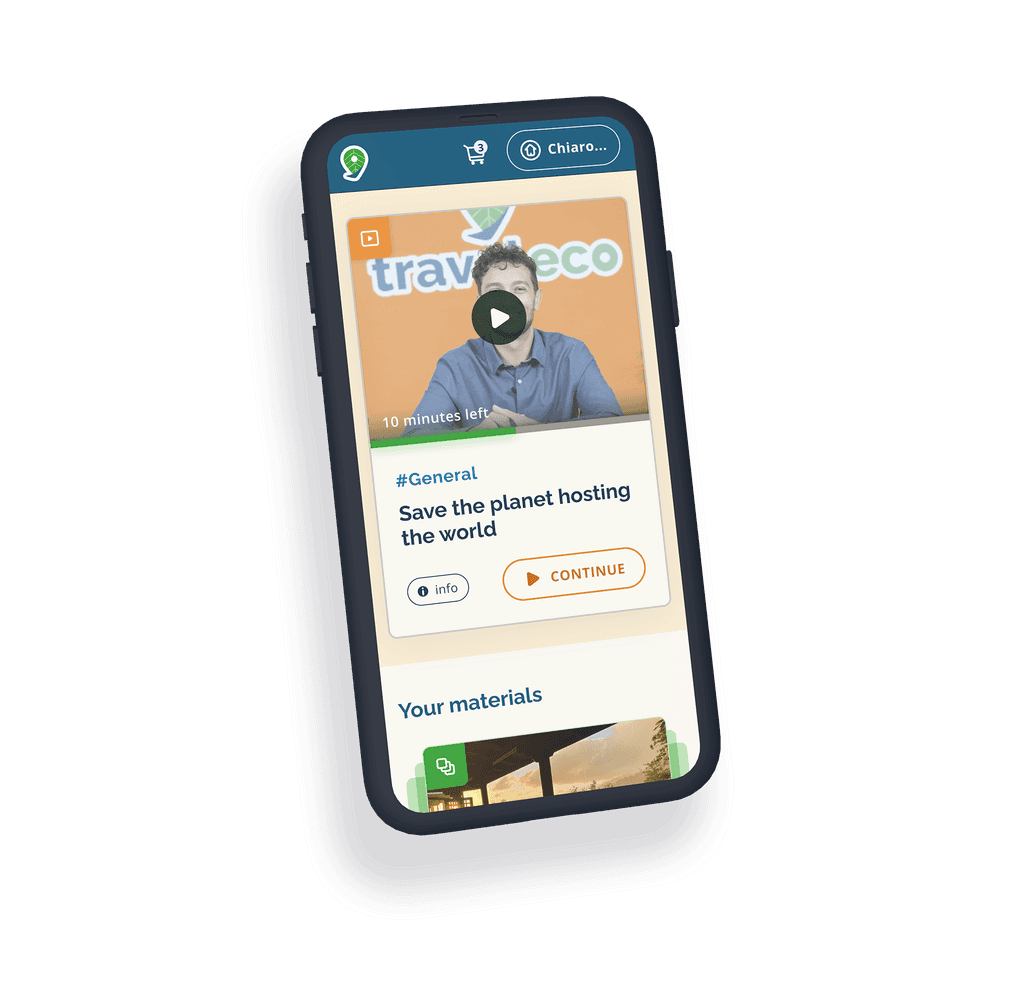
The Traveleco Store is not just E-commerce but more an entertainment platform (Disney Plus, Netflix. Skillshare have been used as a visual reference). We want the host users to engage with more content, discover new, free materials and spend as much time as possible on the platform. Foremost to learn more about sustainability, and consequently proceed with more purchases .
This is the driving reason behind the landing page being distinctly different to the official store. On this page, users can find news about their reports and freshly curated materials, or continue watching one of the video courses. Of course, there is also some steering towards purchasing one of the new hot products or courses.
The hero section has been optimised for flexibility based on the kind of content that Traveleco wants to display once the users land there.

The product page
The product page displays all the information necessary for users to complete the purchase, offering a clear description and frictionless solution. To save developing time and optimise consistency, the product page has taken some of the layouts from the accommodation page.
The product page displays all the information necessary for users to complete the purchase, offering a clear description and frictionless solution. To save developing time and optimise consistency, the product page has taken some of the layouts from the accommodation page.


Surveys
Sustainability survey and carbon footprint calculation are the two main Traveleco products. They initiate the starting point of understanding where hosts stand in terms of their property’s sustainability and act as an important step towards learning how to increase that level.
The "Sustainability survey" is the contact point for many of the host users and their reason behind discovering Traveleco.
With this in mind, the survey has to be engaging and entertaining, with guided steps and pleasant animations to ensure users have a great first impression. Compiling a survey can often be a tedious, boring experience, but we aimed to turn this on its head, creating an excellent experience which will be directly associated with the brand. Different results can also lead to different messages and CTA; customising the experience and navigation based on the level of sustainability.


Crowdfunding
Sustainable crowdfunding is definitely something unique in the booking platform scene. Conscious travel users can support accommodation projects that are working on their sustainability. Through donations, users can, for example, help a hotel implement solar panels through conventional currencies or SardexPay, a cryptocurrency delivered after one of Traveleco’s listed accommodations arrives at their sustainable destination.
Sustainable crowdfunding is definitely something unique in the booking platform scene. Conscious travel users can support accommodation projects that are working on their sustainability. Through donations, users can, for example, help a hotel implement solar panels through conventional currencies or SardexPay, a cryptocurrency delivered after one of Traveleco’s listed accommodations arrives at their sustainable destination.


Every experience within the platform has been designed to focus on the eco-conscious ethos of the brand, inform the user and improve their knowledge of sustainability. We chose to include information provided by previous donors to capitalise on the social effect and guide the user into a successful donation conversion. Listed accommodations can also show the progress they are making by updating announcements with new progress and milestones.
Final design
Final design
The final design has a modern look without looking overly sophisticated with elements highlighting Traveleco’s passion for sustainability.
The user experience on mobile has not been compromised and offers the same detailed levels of information and possibilities as other users.
Future Development
Future Development
One of the biggest challenges has been designing a vast number of different elements, from filters to card sections to different cards, without being repetitive for the user experience, but at the same time ensuring a consistent reliable journey.
This has been, until that day, the biggest interface project of my career in terms of creating the highest number of visuals and graphic elements.
The vast amount of information required for display was more than a normal research accommodation website when compared to booking.com, hostel world, Airbnb, etc. In parallel to the conventional accommodation details we also had to champion sustainable variables.
When approaching information jungles such as this, I've started to evaluate the hover status as a fundamental part of the user experience, especially when it comes to the discovery of new information and squeezing in additional details.
As a designer, I‘ve found it fascinating to explore how many shapes an e-commerce structure can take, and as a UX designer, I have had to find a way to carve a trail for all the possible paths users can take and create a smooth User experience.
Also, there are a myriad of competing booking platforms on the web, and my challenge of reinventing a classic format by being visually exciting but following old-school design patterns has been an interesting mountain to climb.
The product is still in development, but the sections that have already been delivered and published are showing significant improvement in terms of accommodations being contacted.
