Spinamp
Music
Web3
Monetization
ROLE
TIMELINE
TEAM
BRAND
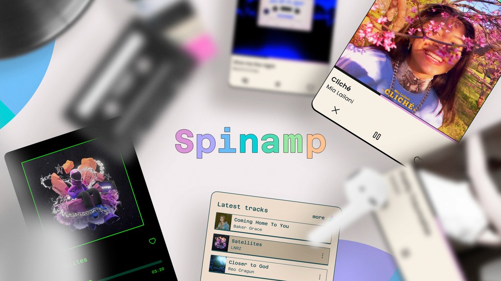
Spinamp is not just another music platform. It is an innovative technology that unified blockchain-based music. It offers a swift, intuitive way to explore, curate, share, listen to, and collect an ever-growing library of Web3 music. The interface seamlessly connects enthusiasts with artists across multiple networks, simplifying the discovery, and enjoyment, making the discovery and purchase of music NFTs a breeze.
Users
Supercollectors
Music Artists
Web3 Music lovers
Users from the blockchain world, accustomed to using cryptocurrencies, who love music and the possibilities that blockchain offers them.

Efficient Workflow Design
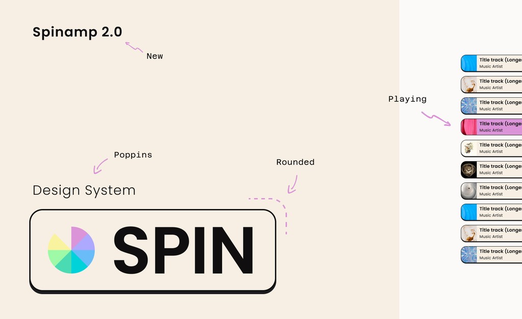
With a ready design system, the initial wireframing and consistency of new functions accelerated dramatically. This made it easy to preview results, evaluate them, and discuss development timelines with developers, determining whether new components were necessary or if existing ones could be utilised.
Primitives & Themes
A beloved feature of our app is the presence of themes. Everyone loves a good theme, right? Being able to preview and prevent any potential theme-related disasters is a must. Thanks to Figma variables, switching between themes is as easy as a double click thus it makes the whole prototyping a breeze.
Default theme
Information Architecture
I also visualised all our product pages through an information architecture to evaluate potential improvements or group pages that are currently distant but potentially semantically closer.


Passkey signup
Flowchart
The first step was to design a flowchart that gave us a perspective of what we were facing and what the main differences would be between mobile and desktop design, considering all the technological differences. Once this flow was validated, we converted it to a more hybrid flow that included high-quality wireframes.
Collect modal
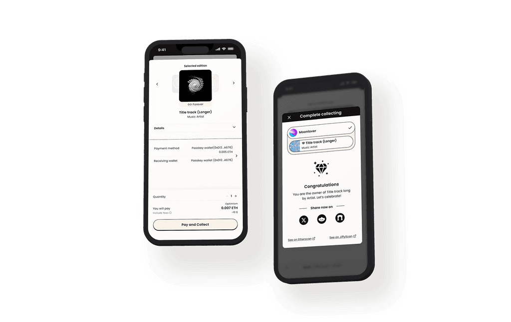
Meanwhile, for various reasons including development timelines and UX considerations, the UI of the modals and purchase screens evolved to clearly divide different information, clustered by category.
Wireflow
Enhanced Payment System
Our system became more powerful as it allows users to pay with our in-app wallet whilst effortlessly transferring assets to their own storage wallet. This seamless integration enhances user control and flexibility in managing their digital assets.
Wallet page
Results

Brief
Final result
Upcoming songs
Interaction
The number of possible interactions with a song is multiple, but we didn't want to overload the UI. We, therefore, opted for a dynamic UI that allows most interactions only after you've added a song to your favorites. Then, a popup lets you add the song to playlists, follow the artist, buy the song, or share it—all without stopping the music.
Next steps


From a UX perspective, I wanted the addition and suggestion of songs to be simple, natural, quick, and fun.
Multiple possibilities
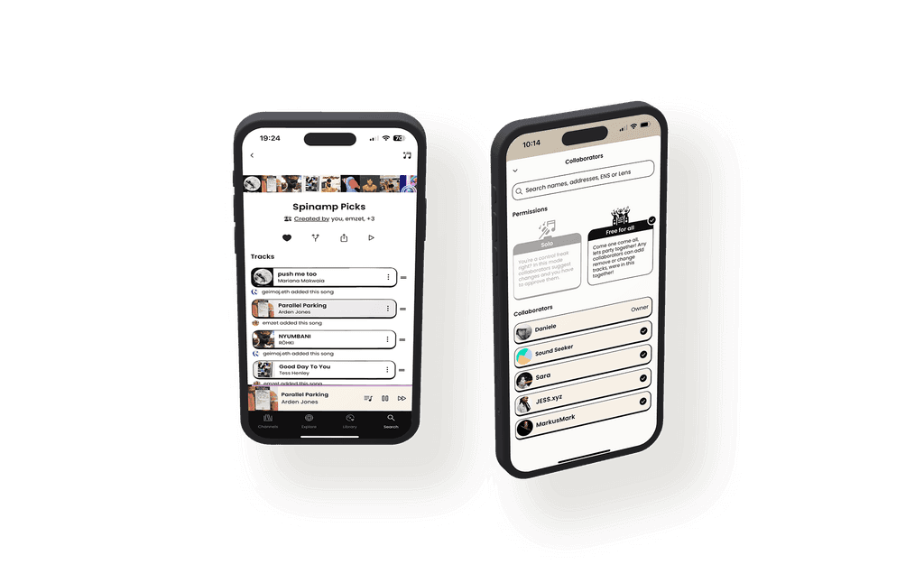
The main UI challenge was to deal with different views - that of the playlist creator, collaborators, and users - without overwhelming the playlist view. We saw this as a golden opportunity to make things better. All interactions with a song and the playlist, and the various responsibilities, had to be clear.
UX Challenges
Even if it sounds cliché, the main goal was to converge the complexity of blockchain technology into a simple, clear, and fun experience, on par with other music platforms. All while encouraging a satisfying experience of listening and interacting with music and artists to promote purchases naturally as a form of support rather than a "market". I tried to make the technological aspect invisible, both through the use of clear, simple, and fun terminology, harnessing the power of blockchain and crypto in service of music, not the other way around. I wanted my work to be, humbly, inspiring for the sector, to facilitate adoption and, above all, to use good UX design to foster the connection between artists and listeners. The challenge was, of course, primarily to understand the complexity and potential of the technology in question and turn them into opportunities for end users
UI Challenges
By giving users the ability to customise their theme and having an interface full of cover artwork, I had to shift my thinking. I couldn't rely on colors anymore, so I started focusing on spacing, functions, and contrasts. This was a great lesson that made me think outside the box—or should I say, outside the color wheel. Even the fonts of different themes presented very different kerning and widths, further constraining me to prevent problems due to this length.


